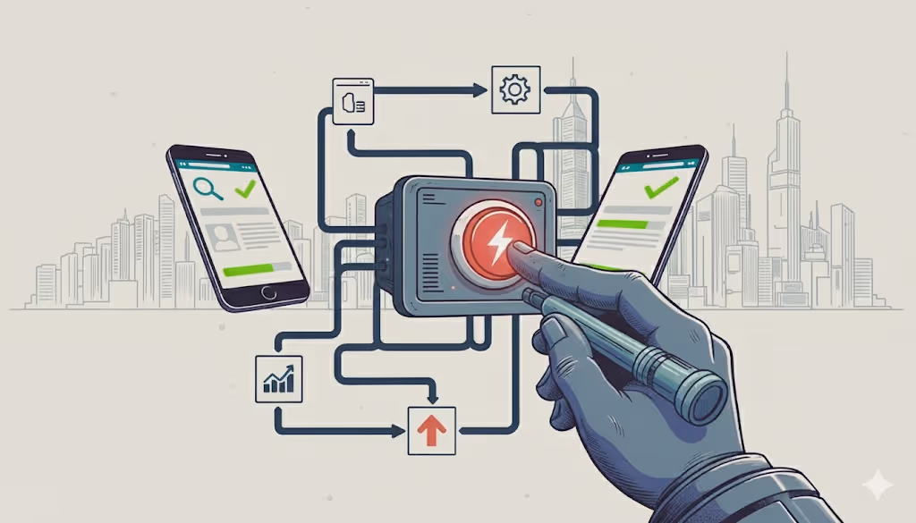
You’ve invested time into building what looks like a great website clean design, nice images, maybe even slick animations. But the problem is: most of those “pretty sites” are still failing at the one job that truly matters: turning visitors into customers.
If you’ve noticed disappointing sales, low engagement, or visitors leaving without a trace the root cause might be one of these 10 conversion killers. The good news: once you fix them, you often get big gains with small tweaks.
1. Slow Loading & Performance Issues
The problem: Pages take too long to load; images are heavy; visitors bounce before seeing anything.
Why it hurts: In 2026, people expect instant delay = frustration = exit.
Fix it by: optimizing images, using lazy loading, minimizing scripts/CSS, caching, and testing site speed regularly (mobile + desktop).
2. Unclear or Overwhelming Navigation/Structure
The problem: Visitors don’t know where to go; menus are confusing; information is buried.
Why it hurts: If prospects have to hunt for what they need many will give up.
Fix it by: organizing content with clear headings and subheadings, simplifying menus, using logical sections, and making the path to conversion obvious (e.g., “Shop”, “Pricing”, “Contact”, “Sign-up”).
3. Weak or Missing Value Proposition / Messaging
The problem: It’s unclear what you offer, who it’s for, or why it matters. Lots of fluff, little clarity.
Why it hurts: Visitors need to know quickly what’s in it for them otherwise they leave.
Fix it by: Writing a clear, benefit-focused headline and subheadline, stating the problem you solve, and what makes you different (unique value proposition).
4. Overly Complex or Distracting Design
The problem: Heavy graphics, animations, popups, too many CTAs distracting from the core action.
Why it hurts: Instead of guiding users to convert, you overload them with noise.
Fix it by: Simplifying the design, using whitespace, limiting distractions, emphasizing one main objective per page (e.g., sign-up, purchase).
5. Broken or Non-Mobile Friendly Checkout / Contact Flow
The problem: On mobile or desktop forms are buggy, steps are too many, or checkout feels unsafe/clunky.
Why it hurts: Every friction point increases abandonment.
Fix it by: Streamlining checkout or signup, minimizing required fields, having a mobile-optimized flow, showing progress steps, ensuring security and trust badges.
6. Lack of Social Proof or Trust Signals
The problem: No reviews, testimonials, trust badges, case studies so your site feels unproven.
Why it hurts: New visitors need reassurance before converting.
Fix it by: Featuring testimonials, case-studies, customer logos, trust badges, and transparent policies.
7. Poor Copywriting Jargon, Walls of Text, No CTAs
The problem: Copy is long, technical, unfocused or there’s no clear call to action.
Why it hurts: Visitors skip reading or don’t know what to do next.
Fix it by: Using simple, benefit-oriented language; short paragraphs; highlighted key points; strong CTAs like “Sign Up”, “Buy Now”, or “Get Started”.
8. Ignoring User Feedback & Not Testing Changes
The problem: You build once and never revisit usability or performance.
Why it hurts: You miss the issues real users face.
Fix it by: Running surveys, A/B tests, tracking analytics (bounce rate, funnel drop-offs), and iterating based on data.
9. Not Addressing Real Pain Points
The problem: Your product doesn’t solve a strong enough problem or you didn’t clearly communicate it.
Why it hurts: Without strong demand, even great design won’t convert.
Fix it by: Validating the core problem, understanding user needs, and aligning messaging around solving that specific pain.
10. No SEO or Content Optimization
The problem: You rely on random traffic; your site isn’t search-optimized.Why it hurts: Without relevant traffic, even a perfect site won’t convert.Fix it by: Keyword research, optimized headings, metadata, alt text, internal links, and shareable content.
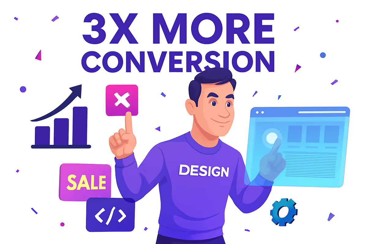
A beautiful website is nice but a high-converting website is what actually grows your business. Fixing these mistakes builds trust, boosts sales, and creates a smooth, modern experience users expect in 2026.
Not sure where your website stands?
Get a conversion & UX audit to uncover hidden issues, missed opportunities, and clear, actionable fixes that turn visitors into customers. Your growth starts with clarity


%201.svg)


.avif)
.avif)
%201.svg)
%201.svg)


%2012.svg)


%201.svg)
%201.svg)

%201.svg)


%202.svg)
%201.svg)


